Bienvenue dans Polices Populaires — là où se rencontrent popularité et qualité. Voici les polices les plus téléchargées et utilisées cette année. Pour des choix sûrs (logos, web, social), commencez ici.
Chaque police phare se distingue par équilibre, lisibilité et polyvalence. Vous trouverez des sans‑serifs modernes, des scripts élégantes, des serifs vintage et des displays minimalistes.
-
( Fonts by Graham Meade - GemFonts )
An elegant and whimsical font with a blend of classic and modern elements.
 Télécharger 364 Téléchargements@WebFont
 -
( Fonts by FONTS BY LYAJKA - Personal-use only. For commercial use please contact owner. )
A bold, distressed, and slanted font with a rugged, grunge aesthetic.
![Revolution(RUS BY LYAJKA) les polices de caractères gratuit t�l�charger]() Télécharger 364 Téléchargements@WebFont
Télécharger 364 Téléchargements@WebFont -
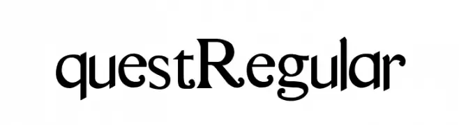
( Gage LaGreca - www.gagelagreca.com )
A classic serif font with elegant strokes and refined details.
![questRegular les polices de caractères gratuit t�l�charger]() Télécharger 364 Téléchargements@WebFont
Télécharger 364 Téléchargements@WebFont -
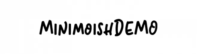
( Fonts by Letterhend Studio )
A playful, bold handwritten font with rounded letterforms and a casual style.
![MinimoishDEMO les polices de caractères gratuit t�l�charger]() Télécharger 364 Téléchargements@WebFont
Télécharger 364 Téléchargements@WebFont -
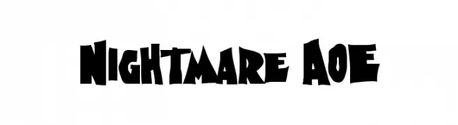
( Fonts by Astigmatic One Eye Typographic Institute - Brian J. Bonislawsky - astigmatic.com )
A bold, jagged font with a horror-themed, dynamic style.
![Nightmare AOE les polices de caractères gratuit t�l�charger]() Télécharger 364 Téléchargements@WebFont
Télécharger 364 Téléchargements@WebFont -
![passarela passarela les polices de caractères gratuit t�l�charger]() Télécharger 364 Téléchargements@WebFont
Télécharger 364 Téléchargements@WebFont -
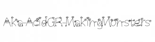
( Fonts by www.aka-acid.com )
A whimsical, monster-themed font with playful, hand-drawn characters.
![Aka-AcidGR-MakingMonsters les polices de caractères gratuit t�l�charger]() Télécharger 363 Téléchargements@WebFont
Télécharger 363 Téléchargements@WebFont -
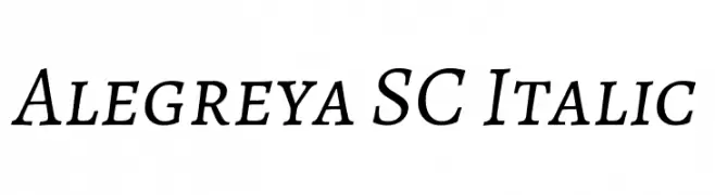
( Copyright 2011 The Alegreya Project Authors (https://github.com/huertatipografica/Alegreya) )
An elegant serif font with an italic style, offering a classic and sophisticated look.
![Alegreya SC Italic les polices de caractères gratuit t�l�charger]() Télécharger 363 Téléchargements@WebFont
Télécharger 363 Téléchargements@WebFont -
( Fonts by maja.mint - creativemarket.com/maja.mint - Personal-use only. For commercial use please contact owner. )
A modern serif font with sharp, angular serifs and high contrast strokes.
![Sandwich Paper Dark les polices de caractères gratuit t�l�charger]() Télécharger 363 Téléchargements@WebFont
Télécharger 363 Téléchargements@WebFont -
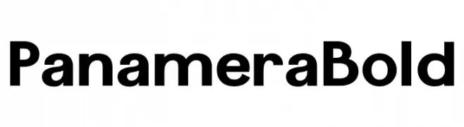
( Fonts by BSozoo - Personal-use only. For commercial use please contact owner. )
A bold, modern sans-serif font with clean lines and strong presence.
![Panamera Bold les polices de caractères gratuit t�l�charger]() Télécharger 363 Téléchargements@WebFont
Télécharger 363 Téléchargements@WebFont -
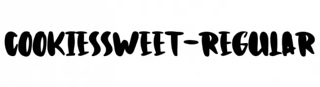
( Fonts by Typetemp Studio )
A playful, bold font with thick, rounded strokes and a hand-drawn style.
![CookiesSweet-Regular les polices de caractères gratuit t�l�charger]() Télécharger 363 Téléchargements@WebFont
Télécharger 363 Téléchargements@WebFont -
( Fonts by www.Fontfabric.com )
A geometric, angular font with octagonal shapes and clean lines.
![RexLight les polices de caractères gratuit t�l�charger]() Télécharger 363 Téléchargements@WebFont
Télécharger 363 Téléchargements@WebFont -
![Garado Blnco les polices de caractères gratuit t�l�charger]() Télécharger 363 Téléchargements@WebFont
Télécharger 363 Téléchargements@WebFont -
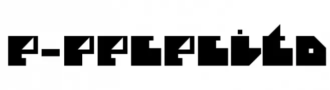
( Fonts by Fernando Haro - defharo.com )
A bold, geometric font with sharp angles and a modern, edgy style.
![e-Pececito les polices de caractères gratuit t�l�charger]() Télécharger 363 Téléchargements@WebFont
Télécharger 363 Téléchargements@WebFont -
( Fonts by Omega Font Labs )
A bold, artistic serif font with sharp angles and smooth curves.
![Kallamar les polices de caractères gratuit t�l�charger]() Télécharger 363 Téléchargements@WebFont
Télécharger 363 Téléchargements@WebFont -
( Fonts by Khurasan )
A bold, playful font with exaggerated curves and a lively appearance.
![Spicy Style les polices de caractères gratuit t�l�charger]() Télécharger 363 Téléchargements@WebFont
Télécharger 363 Téléchargements@WebFont -
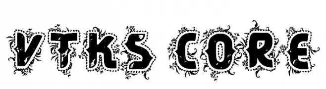
( Fonts by Douglas Vitkauskas - www.vtksdesign.com. Personal-use only. For commercial use please contact owner. )
A bold, decorative font with intricate, organic embellishments and a gothic flair.
![VTKS CORE les polices de caractères gratuit t�l�charger]() Télécharger 363 Téléchargements@WebFont
Télécharger 363 Téléchargements@WebFont -
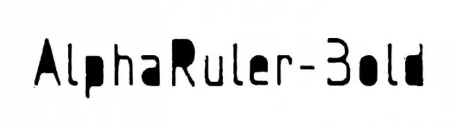
![AlphaRuler-Bold les polices de caractères gratuit t�l�charger]() Télécharger 363 Téléchargements@WebFont
Télécharger 363 Téléchargements@WebFont -
( Fonts by a Habib Shaikh. Personal-use only. For commercial use please contact owner. )
A textured, ornamental font with a stippled effect for an elegant look.
![99%Ornament les polices de caractères gratuit t�l�charger]() Télécharger 363 Téléchargements@WebFont
Télécharger 363 Téléchargements@WebFont -
( Fonts by Apostrophic Lab )
A modern, italic sans-serif font with an expanded width and clean lines.
![Florencesans Exp Italic les polices de caractères gratuit t�l�charger]() Télécharger 363 Téléchargements@WebFont
Télécharger 363 Téléchargements@WebFont -
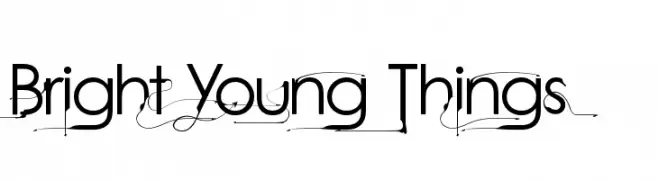
![Bright Young Things les polices de caractères gratuit t�l�charger]() Télécharger 363 Téléchargements@WebFont
Télécharger 363 Téléchargements@WebFont -
( Fonts by Display Studio )
A whimsical and decorative font with playful curls and swirls.
![Sun Flower les polices de caractères gratuit t�l�charger]() Télécharger 363 Téléchargements@WebFont
Télécharger 363 Téléchargements@WebFont -
Polices par defharo. For commercial use please contact the owner.
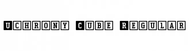
( Uchrony is a condensed proportion slab serif typeface. The font family is made up of 3 styles, Roman, Small Caps & Italics, with 6 weights each (Extra Light, Light, Regular, Medium, Bold and Extra Bold). )
A bold, blocky font with characters enclosed in geometric borders, offering a modern and structured look.
![Uchrony Cube Regular les polices de caractères gratuit t�l�charger]() Télécharger 363 Téléchargements@WebFont
Télécharger 363 Téléchargements@WebFont -
( Fonts by www.kimberlygeswein.com - Kimberly Geswein )
A playful, handwritten font with smooth, flowing lines and a casual style.
![Janda Capslock les polices de caractères gratuit t�l�charger]() Télécharger 363 Téléchargements@WebFont
Télécharger 363 Téléchargements@WebFont -
![PersianKufiOutlineSSK les polices de caractères gratuit t�l�charger]() Télécharger 363 Téléchargements@WebFont
Télécharger 363 Téléchargements@WebFont -
![One Day After Rain les polices de caractères gratuit t�l�charger]() Télécharger 363 Téléchargements@WebFont
Télécharger 363 Téléchargements@WebFont -
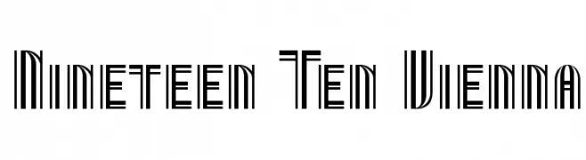
( Fonts by Apostrophic Lab )
A geometric, Art Deco-inspired font with a strong vertical emphasis.
![Nineteen Ten Vienna les polices de caractères gratuit t�l�charger]() Télécharger 363 Téléchargements@WebFont
Télécharger 363 Téléchargements@WebFont -
![Artfonts Sampler les polices de caractères gratuit t�l�charger]() Télécharger 363 Téléchargements@WebFont
Télécharger 363 Téléchargements@WebFont -
( Fonts by Neale Davidson - www.pixelsagas.com )
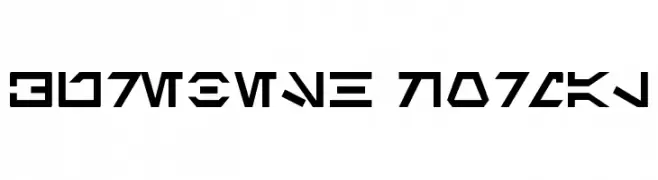
A geometric, angular font representing a fictional alien language.
![Aurebesh Normal les polices de caractères gratuit t�l�charger]() Télécharger 363 Téléchargements@WebFont
Télécharger 363 Téléchargements@WebFont -
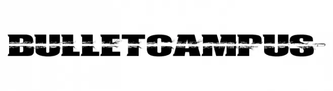
( Fonts by Maelle.K - Thomas Boucherie )
A bold, distressed font with a grunge effect for impactful designs.
![BULLETCAMPUS> les polices de caractères gratuit t�l�charger]() Télécharger 363 Téléchargements@WebFont
Télécharger 363 Téléchargements@WebFont -
( Fonts by Typesgal - Personal-use only. For commercial use please contact owner. )
A classic serif font with sharp, angular serifs and a modern twist.
![Awery SmallCaps les polices de caractères gratuit t�l�charger]() Télécharger 363 Téléchargements@WebFont
Télécharger 363 Téléchargements@WebFont -
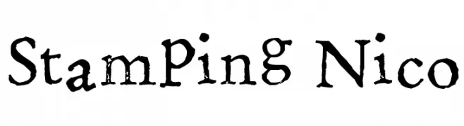
( Fonts by www.fontpanda.com. Personal-use only. For commercial use please contact owner. )
A rustic, handcrafted font with a vintage letterpress style.
![Stamping Nico les polices de caractères gratuit t�l�charger]() Télécharger 363 Téléchargements@WebFont
Télécharger 363 Téléchargements@WebFont -
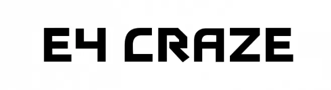
( Fonts by Dan P. Lyons - Personal-use only. For commercial use please contact owner. )
A bold, geometric font with a futuristic and modern design.
![E4 Craze les polices de caractères gratuit t�l�charger]() Télécharger 363 Téléchargements@WebFont
Télécharger 363 Téléchargements@WebFont -
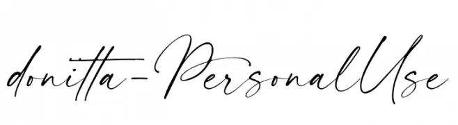
( Fonts by Ef Studio - Personal-use only. For commercial use please contact owner. )
A cursive, handwritten font with elegant, flowing strokes.
![donitta - Personal Use les polices de caractères gratuit t�l�charger]() Télécharger 363 Téléchargements@WebFont
Télécharger 363 Téléchargements@WebFont -
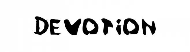
( Fonts by www.kiwi-media.com )
A bold, hand-painted style font with an expressive and dynamic appearance.
![Devotion les polices de caractères gratuit t�l�charger]() Télécharger 363 Téléchargements
Télécharger 363 Téléchargements


Quelles sont les polices les plus populaires en ce moment ?
Poppins, Roboto, Montserrat, Open Sans et Lato sont plébiscitées pour leurs formes nettes et leur large applicabilité — de l’identité de marque aux pages d’atterrissage et affiches.
Quelles polices sont souvent utilisées pour les logos ?
Les sans‑serifs géométriques (par ex. Poppins, familles de style Gotham) sont un choix courant pour un branding propre et scalable. Pour une touche personnelle, les scripts et styles manuscrits restent des classiques. Associez un display marqué pour les titres à un texte neutre pour l’équilibre et la reconnaissance.
À quelle fréquence la liste est‑elle mise à jour ?
Régulièrement, selon les téléchargements et l’activité réelle. Revenez souvent pour découvrir les futures favorites.
💡 Astuce : ajoutez cette page aux favoris — les tendances changent vite et les polices phares d’aujourd’hui peuvent inspirer le rebranding de demain.