Bienvenue dans Polices Populaires — là où se rencontrent popularité et qualité. Voici les polices les plus téléchargées et utilisées cette année. Pour des choix sûrs (logos, web, social), commencez ici.
Chaque police phare se distingue par équilibre, lisibilité et polyvalence. Vous trouverez des sans‑serifs modernes, des scripts élégantes, des serifs vintage et des displays minimalistes.
-
( Daymarius - www.creativefabrica.com/designer/Daymarius )
A serif font with sharp, angular serifs and a medieval touch.
 Télécharger 315 Téléchargements@WebFont
 -
![The Gaeilge Kids les polices de caractères gratuit t�l�charger]() Télécharger 315 Téléchargements@WebFont
Télécharger 315 Téléchargements@WebFont -
( Fonts by dartcanada.tripod.com - Darren Rigby )
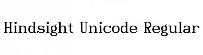
A modern serif font with clean lines and balanced proportions.
![Hindsight Unicode Regular les polices de caractères gratuit t�l�charger]() Télécharger 315 Téléchargements@WebFont
Télécharger 315 Téléchargements@WebFont -
( Fonts by Koczman Balint - magiquefonts.gportal.hu )
A modern, geometric font with rounded edges and a bold, futuristic style.
![Infinity Media les polices de caractères gratuit t�l�charger]() Télécharger 315 Téléchargements@WebFont
Télécharger 315 Téléchargements@WebFont -
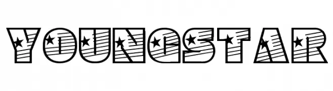
![YoungStar les polices de caractères gratuit t�l�charger]() Télécharger 315 Téléchargements@WebFont
Télécharger 315 Téléchargements@WebFont -
( Fonts by Billy Argel - Personal-use only. For commercial use please contact owner. )
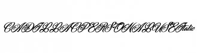
An elegant, italic script font with ornate flourishes and a luxurious appearance.
![CADILLAC PERSONAL USE Italic les polices de caractères gratuit t�l�charger]() Télécharger 315 Téléchargements@WebFont
Télécharger 315 Téléchargements@WebFont -
( LJ Design Studios - www.ljdesignstudios.com )
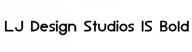
A bold, modern sans-serif font with clean, geometric lines.
![LJ Design Studios IS Bold les polices de caractères gratuit t�l�charger]() Télécharger 315 Téléchargements@WebFont
Télécharger 315 Téléchargements@WebFont -
![Javatronic les polices de caractères gratuit t�l�charger]() Télécharger 315 Téléchargements@WebFont
Télécharger 315 Téléchargements@WebFont -
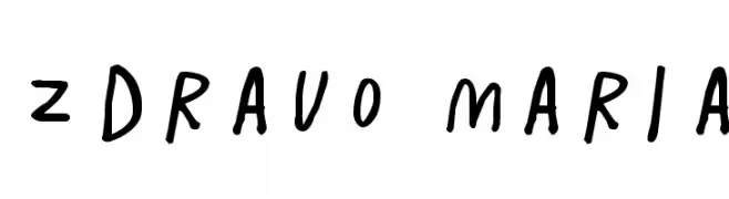
( Fonts by Rodrigo German - RASDESIGN )
A playful, handwritten font with irregular strokes and a lively feel.
![ZDRAVO MARIA les polices de caractères gratuit t�l�charger]() Télécharger 315 Téléchargements@WebFont
Télécharger 315 Téléchargements@WebFont -
Polices par fontsnthings. For commercial use please contact the owner.
![Circle Things les polices de caractères gratuit t�l�charger]() Télécharger 315 Téléchargements@WebFont
Télécharger 315 Téléchargements@WebFont -
![razzo les polices de caractères gratuit t�l�charger]() Télécharger 315 Téléchargements@WebFont
Télécharger 315 Téléchargements@WebFont -
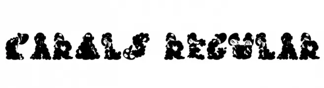
![Carols Regular les polices de caractères gratuit t�l�charger]() Télécharger 315 Téléchargements@WebFont
Télécharger 315 Téléchargements@WebFont -
( Fonts by Balpirick Studio - https://www.creativefabrica.com/designer/balpirick/ref/308299/ - Personal-use only. For commercial use please contact owner. )
A fluid, cursive script font with elegant, connected letters.
![Geraldo Island les polices de caractères gratuit t�l�charger]() Télécharger 315 Téléchargements@WebFont
Télécharger 315 Téléchargements@WebFont -
( Iconian Fonts - Daniel Zadorozny - www.iconian.com )
A bold, geometric font with a condensed and modern style.
![Watchtower Drop les polices de caractères gratuit t�l�charger]() Télécharger 315 Téléchargements@WebFont
Télécharger 315 Téléchargements@WebFont -
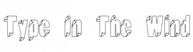
![Type In The Wind les polices de caractères gratuit t�l�charger]() Télécharger 315 Téléchargements@WebFont
Télécharger 315 Téléchargements@WebFont -
( Fonts by Weape Studio )
A playful, bold font with rounded edges and a hand-drawn feel.
![Hello Jerry les polices de caractères gratuit t�l�charger]() Télécharger 315 Téléchargements@WebFont
Télécharger 315 Téléchargements@WebFont -
( Fonts by ShyFonts )
A bold, hand-drawn font with a playful grunge style and shadow effect.
![SF Grunge Sans Shadow les polices de caractères gratuit t�l�charger]() Télécharger 315 Téléchargements@WebFont
Télécharger 315 Téléchargements@WebFont -
( Fonts by Matthew Luckow - Personal-use only. For commercial use please contact owner. )
A sharp, angular font with a mythical, rune-like appearance.
![Dragon Alphabet [Thuum] les polices de caractères gratuit t�l�charger]() Télécharger 315 Téléchargements@WebFont
Télécharger 315 Téléchargements@WebFont -
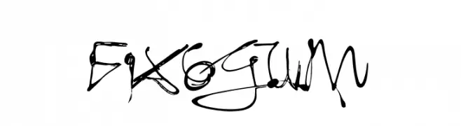
( Fonts by Ingo Zimmermann - www.ingofonts.com )
A dynamic, brush-like font with bold strokes and an expressive, hand-drawn appearance.
![Fixogum les polices de caractères gratuit t�l�charger]() Télécharger 315 Téléchargements@WebFont
Télécharger 315 Téléchargements@WebFont -
( Fonts by Astigmatic )
A tall, elegant font with playful, whimsical elements and subtle serifs.
![Bigelow Rules les polices de caractères gratuit t�l�charger]() Télécharger 315 Téléchargements@WebFont
Télécharger 315 Téléchargements@WebFont -
( Marco Ballarè - www.marcoballare.com )
A modern, geometric sans-serif font with clean lines and balanced spacing.
![Hasta Grotesk les polices de caractères gratuit t�l�charger]() Télécharger 315 Téléchargements@WebFont
Télécharger 315 Téléchargements@WebFont -
Polices par satrianovian20. For commercial use please contact the owner.
( elemental acts )
A playful, hand-drawn font with circular outlines around each character.
![e-font les polices de caractères gratuit t�l�charger]() Télécharger 315 Téléchargements@WebFont
Télécharger 315 Téléchargements@WebFont -
( Fonts by Rudi Irawan - Personal-use only. For commercial use please contact owner. )
A playful and elegant script font with a fluid, handwritten style.
![Seminyak Regular les polices de caractères gratuit t�l�charger]() Télécharger 315 Téléchargements@WebFont
Télécharger 315 Téléchargements@WebFont -
( Fonts by Andrew McCluskey - nalgames.com )
A geometric, beveled font with a three-dimensional, outlined design.
![Bevel Fifteen Regular les polices de caractères gratuit t�l�charger]() Télécharger 315 Téléchargements@WebFont
Télécharger 315 Téléchargements@WebFont -
( Fonts by Bangkit Tri Setiadi - Personal-use only. For commercial use please contact owner. )
A bold, flowing script font with elegant curves and smooth connections.
![Brayles Regular les polices de caractères gratuit t�l�charger]() Télécharger 315 Téléchargements@WebFont
Télécharger 315 Téléchargements@WebFont -
( Fonts by http://perso.calixo.net/~uzim/ )
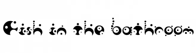
A decorative font with playful circular shapes and dots, offering a whimsical and abstract style.
![Fish in the bathroom les polices de caractères gratuit t�l�charger]() Télécharger 315 Téléchargements@WebFont
Télécharger 315 Téléchargements@WebFont -
( Fonts by Socialh. Personal-use only. For commercial use please contact owner. )
A bold, playful font with rounded terminals and consistent spacing.
![Fagr les polices de caractères gratuit t�l�charger]() Télécharger 315 Téléchargements@WebFont
Télécharger 315 Téléchargements@WebFont -
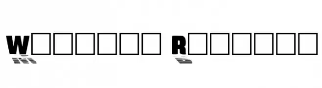
![Wharmby Regular les polices de caractères gratuit t�l�charger]() Télécharger 315 Téléchargements@WebFont
Télécharger 315 Téléchargements@WebFont -
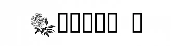
![Floral 1 les polices de caractères gratuit t�l�charger]() Télécharger 315 Téléchargements@WebFont
Télécharger 315 Téléchargements@WebFont -
( www.behance.net/Poemhaiku )
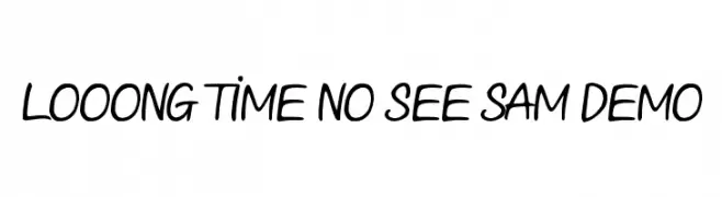
A playful, casual handwritten font with smooth, flowing strokes.
![Looong time no see Sam Demo les polices de caractères gratuit t�l�charger]() Télécharger 315 Téléchargements@WebFont
Télécharger 315 Téléchargements@WebFont -
( Fonts by Steppot )
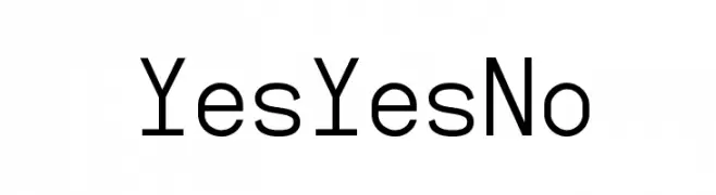
A modern, geometric sans-serif font with uniform strokes and high readability.
![YesYesNo les polices de caractères gratuit t�l�charger]() Télécharger 315 Téléchargements@WebFont
Télécharger 315 Téléchargements@WebFont -
( 7NTypes - Situjuh Nazara - 7ntypes.com )
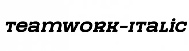
A bold, italic font with strong, dynamic strokes and a modern style.
![TeamWork-Italic les polices de caractères gratuit t�l�charger]() Télécharger 315 Téléchargements@WebFont
Télécharger 315 Téléchargements@WebFont -
( Fonts by Cumberland Fontworks - http://www222.pair.com/sjohn/fonts.htm - S. John Ross )
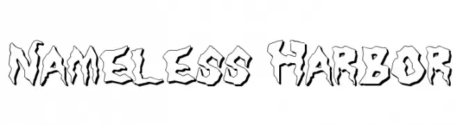
A bold, jagged font with a rugged, hand-carved appearance.
![Nameless Harbor les polices de caractères gratuit t�l�charger]() Télécharger 315 Téléchargements@WebFont
Télécharger 315 Téléchargements@WebFont -
( Fonts by www.junkohanhero.com )
A chaotic, ransom note-style font with mismatched, distressed characters.
![Kuusinollakahdeksan les polices de caractères gratuit t�l�charger]() Télécharger 315 Téléchargements@WebFont
Télécharger 315 Téléchargements@WebFont -
![AntykwaTorunskaCond-Bold les polices de caractères gratuit t�l�charger]() Télécharger 315 Téléchargements@WebFont
Télécharger 315 Téléchargements@WebFont


![Dragon Alphabet [Thuum] les polices de caractères gratuit t�l�charger](https://d144mzi0q5mijx.cloudfront.net/img/D/R/Dragon-Alphabet-Thuum.webp)


Quelles sont les polices les plus populaires en ce moment ?
Poppins, Roboto, Montserrat, Open Sans et Lato sont plébiscitées pour leurs formes nettes et leur large applicabilité — de l’identité de marque aux pages d’atterrissage et affiches.
Quelles polices sont souvent utilisées pour les logos ?
Les sans‑serifs géométriques (par ex. Poppins, familles de style Gotham) sont un choix courant pour un branding propre et scalable. Pour une touche personnelle, les scripts et styles manuscrits restent des classiques. Associez un display marqué pour les titres à un texte neutre pour l’équilibre et la reconnaissance.
À quelle fréquence la liste est‑elle mise à jour ?
Régulièrement, selon les téléchargements et l’activité réelle. Revenez souvent pour découvrir les futures favorites.
💡 Astuce : ajoutez cette page aux favoris — les tendances changent vite et les polices phares d’aujourd’hui peuvent inspirer le rebranding de demain.