Bienvenue dans Polices Populaires — là où se rencontrent popularité et qualité. Voici les polices les plus téléchargées et utilisées cette année. Pour des choix sûrs (logos, web, social), commencez ici.
Chaque police phare se distingue par équilibre, lisibilité et polyvalence. Vous trouverez des sans‑serifs modernes, des scripts élégantes, des serifs vintage et des displays minimalistes.
-
( Fonts by Tri Sakti Oktaviano )
A bold, playful font with thick, rounded characters and a whimsical style.
 Télécharger 180 Téléchargements@WebFont
 -
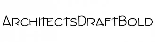
( Michael Hassler - hassified.blogspot.com/ )
A bold, handwritten-style font with a modern, architectural aesthetic.
![ArchitectsDraftBold les polices de caractères gratuit t�l�charger]() Télécharger 180 Téléchargements@WebFont
Télécharger 180 Téléchargements@WebFont -
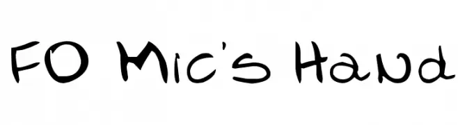
( Fonts by www.fontologie.com )
A playful, handwritten font with bold strokes and a casual, whimsical style.
![FO-Mic's Hand les polices de caractères gratuit t�l�charger]() Télécharger 180 Téléchargements@WebFont
Télécharger 180 Téléchargements@WebFont -
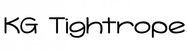
( Fonts by Kimberly Geswein )
A playful, rounded font with smooth curves and uniform strokes.
![KG Tightrope les polices de caractères gratuit t�l�charger]() Télécharger 180 Téléchargements@WebFont
Télécharger 180 Téléchargements@WebFont -
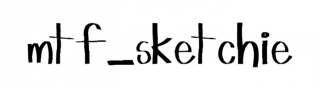
( Fonts by www.fontologie.com )
A playful, hand-drawn font with a whimsical and artistic style.
![mtf_sketchie les polices de caractères gratuit t�l�charger]() Télécharger 180 Téléchargements@WebFont
Télécharger 180 Téléchargements@WebFont -
( Fonts by Misti`s Fonts - mistifonts.com - Personal-use only. For commercial use please contact owner. )
A playful, handwritten font with a casual and friendly style.
![MyDecember les polices de caractères gratuit t�l�charger]() Télécharger 180 Téléchargements@WebFont
Télécharger 180 Téléchargements@WebFont -
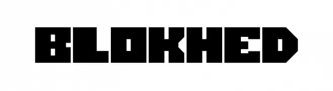
![Blokhed les polices de caractères gratuit t�l�charger]() Télécharger 180 Téléchargements@WebFont
Télécharger 180 Téléchargements@WebFont -
![Unstable_raw_release les polices de caractères gratuit t�l�charger]() Télécharger 180 Téléchargements@WebFont
Télécharger 180 Téléchargements@WebFont -
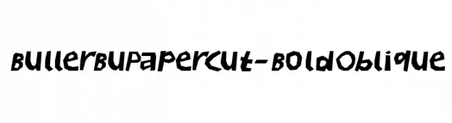
( Fonts by Manfred Klein. Free for private and charity use. Free for commercial with donation to organizations )
A bold, oblique font with a papercut effect, offering a playful and handcrafted style.
![BullerBuPapercut-BoldOblique les polices de caractères gratuit t�l�charger]() Télécharger 180 Téléchargements@WebFont
Télécharger 180 Téléchargements@WebFont -
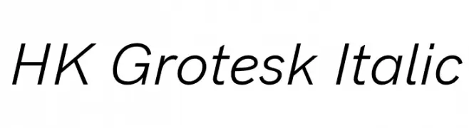
( Fonts by Hanken Design Co. - Personal-use only. For commercial use please contact owner. )
A modern, italicized sans-serif font with a clean and minimalistic design.
![HK Grotesk Italic les polices de caractères gratuit t�l�charger]() Télécharger 180 Téléchargements@WebFont
Télécharger 180 Téléchargements@WebFont -
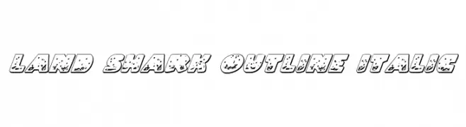
( Fonts by Daniel Zadorozny - www.iconian.com )
A bold, italicized outline font with a textured, playful design.
![Land Shark Outline Italic les polices de caractères gratuit t�l�charger]() Télécharger 180 Téléchargements@WebFont
Télécharger 180 Téléchargements@WebFont -
( Fonts by Manfred Klein. Free for private and charity use. Free for commercial with donation to organizations )
A collection of abstract, artistic symbols resembling faces, with unique and intricate designs.
![AbstractFacesThree les polices de caractères gratuit t�l�charger]() Télécharger 180 Téléchargements@WebFont
Télécharger 180 Téléchargements@WebFont -
( Fonts by Apostrophic Lab )
Bold, italicized font with a college-inspired, outlined style.
![Republikaps Exp - College Italic les polices de caractères gratuit t�l�charger]() Télécharger 180 Téléchargements@WebFont
Télécharger 180 Téléchargements@WebFont -
( Fonts by bob istheowl http://luc.devroye.org/bobistheowl.html )
Ornate, vintage serif font with bold, high-contrast strokes and decorative details.
![Gypsy Tarot-Minor Arcana les polices de caractères gratuit t�l�charger]() Télécharger 180 Téléchargements@WebFont
Télécharger 180 Téléchargements@WebFont -
( Fonts by Din Studio - Donis Miftahudin - Personal-use only. For commercial use please contact owner. )
A bold, serif font with a vintage yet modern appeal, featuring strong strokes and sharp serifs.
![Remind Personal Use les polices de caractères gratuit t�l�charger]() Télécharger 180 Téléchargements@WebFont
Télécharger 180 Téléchargements@WebFont -
( Fonts by www.typodermicfonts.com - Ray Larabie )
A bold, playful font with a 3D comic book style and thick outlines.
![Baveuse3D-Regular les polices de caractères gratuit t�l�charger]() Télécharger 180 Téléchargements@WebFont
Télécharger 180 Téléchargements@WebFont -
( گالری فانت فارسی پژوهش آريانا - only compatible with Farsi and Arabic )
A refined and elegant script font with a traditional Naskh style.
![Naskh Cheft Kham les polices de caractères gratuit t�l�charger]() Télécharger 180 Téléchargements@WebFont
Télécharger 180 Téléchargements@WebFont -
![Sthencyl Demo les polices de caractères gratuit t�l�charger]() Télécharger 180 Téléchargements@WebFont
Télécharger 180 Téléchargements@WebFont -
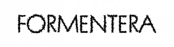
( Fonts by Woodcutter )
A bold, textured font with a hand-drawn, sketch-like appearance.
![Formentera les polices de caractères gratuit t�l�charger]() Télécharger 180 Téléchargements@WebFont
Télécharger 180 Téléchargements@WebFont -
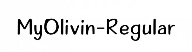
( Fonts by Alifinart Studio - Personal-use only. For commercial use please contact owner. )
A playful, handwritten font with smooth, rounded letterforms.
![MyOlivin-Regular les polices de caractères gratuit t�l�charger]() Télécharger 180 Téléchargements@WebFont
Télécharger 180 Téléchargements@WebFont -
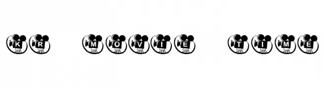
( Fonts by Kat`s Fun Fonts - Personal-use only. For commercial use please contact owner. )
A playful, film-themed font with bold, rounded characters encased in camera motif badges.
![KR Movie Time les polices de caractères gratuit t�l�charger]() Télécharger 180 Téléchargements@WebFont
Télécharger 180 Téléchargements@WebFont -
( Fonts by Lavenia )
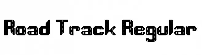
A bold, geometric font with a stencil-like, industrial design.
![Road Track Regular les polices de caractères gratuit t�l�charger]() Télécharger 180 Téléchargements@WebFont
Télécharger 180 Téléchargements@WebFont -
( Fonts by www.houseoflime.com )
A bold, trapezoidal font with a playful and modern design.
![Trapeze les polices de caractères gratuit t�l�charger]() Télécharger 180 Téléchargements@WebFont
Télécharger 180 Téléchargements@WebFont -
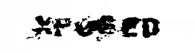
![Xposed les polices de caractères gratuit t�l�charger]() Télécharger 180 Téléchargements@WebFont
Télécharger 180 Téléchargements@WebFont -
![unusual suspects [ square eyes ] les polices de caractères gratuit t�l�charger]() Télécharger 180 Téléchargements@WebFont
Télécharger 180 Téléchargements@WebFont -
( Fonts by Graham Meade - GemFonts )
A religious-themed dingbat font with detailed illustrations.
![JFC les polices de caractères gratuit t�l�charger]() Télécharger 180 Téléchargements@WebFont
Télécharger 180 Téléchargements@WebFont -
( Fonts by Vladimir Nikolic - www.creativefabrica.com/designer/vladimirnikolic/ - Personal-use only. For commercial use please contact owner. )
A bold, decorative font with a 3D shadow effect and striped pattern.
![Driveller Regular les polices de caractères gratuit t�l�charger]() Télécharger 180 Téléchargements@WebFont
Télécharger 180 Téléchargements@WebFont -
![Krishna Condensed les polices de caractères gratuit t�l�charger]() Télécharger 180 Téléchargements
Télécharger 180 Téléchargements -
( Fonts by Winter Design Studio - winty5.wixsite.com/noahtheawesome/ - Personal-use only. For commercial use please contact owner. )
A bold, geometric font with high contrast and a structured appearance.
![5Contrastio Regular les polices de caractères gratuit t�l�charger]() Télécharger 180 Téléchargements@WebFont
Télécharger 180 Téléchargements@WebFont -
Polices par spideraysfonts. For commercial use please contact the owner.
( BRAILLE TAIJITU )
A Braille-inspired font featuring yin-yang symbols for a harmonious visual and tactile experience.
![BRAILLE TAIJITU les polices de caractères gratuit t�l�charger]() Télécharger 180 Téléchargements@WebFont
Télécharger 180 Téléchargements@WebFont -
( Fonts by www.aenigmafonts.com )
Ornamental, symmetrical tile-patterned decorative font.
![Symmetry BRK les polices de caractères gratuit t�l�charger]() Télécharger 180 Téléchargements@WebFont
Télécharger 180 Téléchargements@WebFont -
( www.wix.com/danielcohenas/designlab )
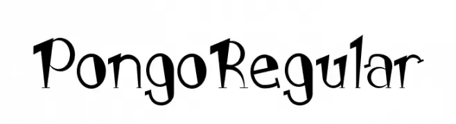
A playful and whimsical font with a hand-drawn, dynamic style.
![PongoRegular les polices de caractères gratuit t�l�charger]() Télécharger 180 Téléchargements@WebFont
Télécharger 180 Téléchargements@WebFont -
![Callallied les polices de caractères gratuit t�l�charger]() Télécharger 180 Téléchargements@WebFont
Télécharger 180 Téléchargements@WebFont -
( Fonts by Apostrophic Lab )
A modern, geometric font with tall, narrow characters and consistent stroke width.
![So Normal les polices de caractères gratuit t�l�charger]() Télécharger 180 Téléchargements@WebFont
Télécharger 180 Téléchargements@WebFont -
( Fonts by Impallari Type )
A bold, modern sans-serif font with a semi-condensed style and minimal contrast.
![Encode Sans SemiCondensed ExtraBold les polices de caractères gratuit t�l�charger]() Télécharger 180 Téléchargements@WebFont
Télécharger 180 Téléchargements@WebFont


![unusual suspects [ square eyes ] les polices de caractères gratuit t�l�charger](https://d144mzi0q5mijx.cloudfront.net/img/U/N/unusual-suspects-square-eyes.webp)


Quelles sont les polices les plus populaires en ce moment ?
Poppins, Roboto, Montserrat, Open Sans et Lato sont plébiscitées pour leurs formes nettes et leur large applicabilité — de l’identité de marque aux pages d’atterrissage et affiches.
Quelles polices sont souvent utilisées pour les logos ?
Les sans‑serifs géométriques (par ex. Poppins, familles de style Gotham) sont un choix courant pour un branding propre et scalable. Pour une touche personnelle, les scripts et styles manuscrits restent des classiques. Associez un display marqué pour les titres à un texte neutre pour l’équilibre et la reconnaissance.
À quelle fréquence la liste est‑elle mise à jour ?
Régulièrement, selon les téléchargements et l’activité réelle. Revenez souvent pour découvrir les futures favorites.
💡 Astuce : ajoutez cette page aux favoris — les tendances changent vite et les polices phares d’aujourd’hui peuvent inspirer le rebranding de demain.