Bienvenue dans Polices Populaires — là où se rencontrent popularité et qualité. Voici les polices les plus téléchargées et utilisées cette année. Pour des choix sûrs (logos, web, social), commencez ici.
Chaque police phare se distingue par équilibre, lisibilité et polyvalence. Vous trouverez des sans‑serifs modernes, des scripts élégantes, des serifs vintage et des displays minimalistes.
-
 Télécharger 1748 Téléchargements@WebFont
 -
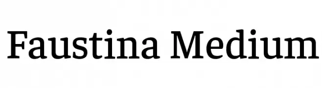
( Copyright 2016 The Faustina Project Authors (omnibus.type@gmail.com) )
A classic serif font with medium weight, offering elegance and readability.
![Faustina Medium les polices de caractères gratuit t�l�charger]() Télécharger 1748 Téléchargements@WebFont
Télécharger 1748 Téléchargements@WebFont -
![Ibiza les polices de caractères gratuit t�l�charger]() Télécharger 1748 Téléchargements@WebFont
Télécharger 1748 Téléchargements@WebFont -
( Fonts by Khurasan )
A playful, hand-drawn font with bold, irregular letterforms.
![Crispy Samosa les polices de caractères gratuit t�l�charger]() Télécharger 1747 Téléchargements@WebFont
Télécharger 1747 Téléchargements@WebFont -
( Fonts by pinklovesconsent.com )
A bold slab serif font with strong, geometric serifs and a commanding presence.
![Pink Slab 070 les polices de caractères gratuit t�l�charger]() Télécharger 1747 Téléchargements@WebFont
Télécharger 1747 Téléchargements@WebFont -
( nilscordes.com )
A playful, casual handwritten font with smooth, rounded edges.
![Cardenio Modern les polices de caractères gratuit t�l�charger]() Télécharger 1747 Téléchargements@WebFont
Télécharger 1747 Téléchargements@WebFont -
![VI Bang Lang les polices de caractères gratuit t�l�charger]() Télécharger 1747 Téléchargements@WebFont
Télécharger 1747 Téléchargements@WebFont -
![aKa les polices de caractères gratuit t�l�charger]() Télécharger 1747 Téléchargements@WebFont
Télécharger 1747 Téléchargements@WebFont -
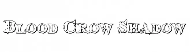
( Fonts by Daniel Zadorozny - www.iconian.com )
A rugged, distressed font with bold outlines and shadow effects.
![Blood Crow Shadow les polices de caractères gratuit t�l�charger]() Télécharger 1747 Téléchargements@WebFont
Télécharger 1747 Téléchargements@WebFont -
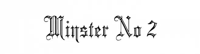
( Fonts by Paul Lloyd )
A decorative blackletter font with intricate, gothic-inspired details.
![Minster No 2 les polices de caractères gratuit t�l�charger]() Télécharger 1747 Téléchargements@WebFont
Télécharger 1747 Téléchargements@WebFont -
( Fonts by Des Gomez )
A playful, handwritten font with a casual and dynamic style.
![Hypebeast les polices de caractères gratuit t�l�charger]() Télécharger 1746 Téléchargements@WebFont
Télécharger 1746 Téléchargements@WebFont -
( Fonts by Giulia Ursenna Dorati - www.ohmygud.com )
A modern, sans-serif font with a clean and minimalist design.
![Wilmina les polices de caractères gratuit t�l�charger]() Télécharger 1746 Téléchargements@WebFont
Télécharger 1746 Téléchargements@WebFont -
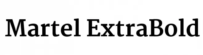
( Copyright (c) 2015 Dan Reynolds. )
A robust, extra bold serif typeface with high contrast and classic elegance.
![Martel ExtraBold les polices de caractères gratuit t�l�charger]() Télécharger 1746 Téléchargements@WebFont
Télécharger 1746 Téléchargements@WebFont -
![Varsity Classic C les polices de caractères gratuit t�l�charger]() Télécharger 1746 Téléchargements@WebFont
Télécharger 1746 Téléchargements@WebFont -
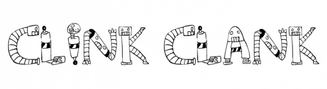
![Clink Clank les polices de caractères gratuit t�l�charger]() Télécharger 1746 Téléchargements@WebFont
Télécharger 1746 Téléchargements@WebFont -
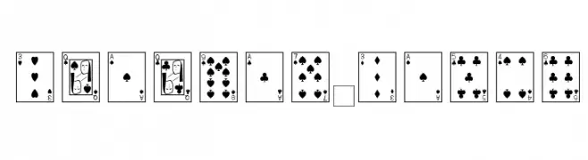
![Playing Cards les polices de caractères gratuit t�l�charger]() Télécharger 1746 Téléchargements@WebFont
Télécharger 1746 Téléchargements@WebFont -
( Fonts by www.fontalicious.com )
A bold, playful font with uniform strokes and whimsical elements.
![Pussycat Snickers les polices de caractères gratuit t�l�charger]() Télécharger 1746 Téléchargements@WebFont
Télécharger 1746 Téléchargements@WebFont -
![Bad Films les polices de caractères gratuit t�l�charger]() Télécharger 1746 Téléchargements@WebFont
Télécharger 1746 Téléchargements@WebFont -
( Fonts by Fontfabric - Svetoslav Simov - Personal-use only. For commercial use please contact owner. )
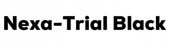
A bold, modern font with clean, geometric lines and excellent readability.
![Nexa-Trial Black les polices de caractères gratuit t�l�charger]() Télécharger 1745 Téléchargements@WebFont
Télécharger 1745 Téléchargements@WebFont -
( Fonts by Fikryal studio )
A bold, playful handwritten font with rounded edges and dynamic style.
![CHERRY LIME les polices de caractères gratuit t�l�charger]() Télécharger 1745 Téléchargements@WebFont
Télécharger 1745 Téléchargements@WebFont -
![CooperHewitt-BoldItalic les polices de caractères gratuit t�l�charger]() Télécharger 1745 Téléchargements@WebFont
Télécharger 1745 Téléchargements@WebFont -
![Rosemary les polices de caractères gratuit t�l�charger]() Télécharger 1745 Téléchargements@WebFont
Télécharger 1745 Téléchargements@WebFont -
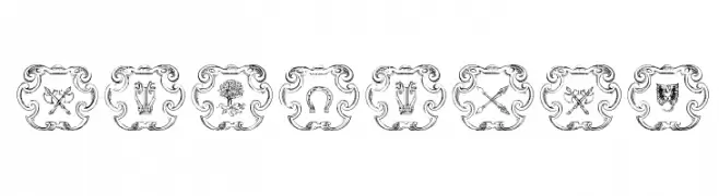
![Armorial les polices de caractères gratuit t�l�charger]() Télécharger 1745 Téléchargements@WebFont
Télécharger 1745 Téléchargements@WebFont -
![Medusa Regular les polices de caractères gratuit t�l�charger]() Télécharger 1745 Téléchargements@WebFont
Télécharger 1745 Téléchargements@WebFont -
![EasterFunbyTom les polices de caractères gratuit t�l�charger]() Télécharger 1745 Téléchargements@WebFont
Télécharger 1745 Téléchargements@WebFont -
![Edda les polices de caractères gratuit t�l�charger]() Télécharger 1745 Téléchargements@WebFont
Télécharger 1745 Téléchargements@WebFont -
![JudasCaps Wd les polices de caractères gratuit t�l�charger]() Télécharger 1745 Téléchargements@WebFont
Télécharger 1745 Téléchargements@WebFont -
( Pisto Casero - Gilberto Moya Perona - www.pistocasero.com )
A geometric and modern font with decorative line elements.
![Santanelli-PERSONAL-USE-ONLY les polices de caractères gratuit t�l�charger]() Télécharger 1744 Téléchargements@WebFont
Télécharger 1744 Téléchargements@WebFont -
( NimaVisual - Nima Visual - nimavisual.tumblr.com/ )
A modern sans-serif font with smooth curves and a slightly condensed structure.
![Quesha les polices de caractères gratuit t�l�charger]() Télécharger 1744 Téléchargements@WebFont
Télécharger 1744 Téléchargements@WebFont -
( Fonts by Yosuke Masaki - yosukemasaki.com - Personal-use only. For commercial use please contact owner. )
A bold, geometric font with strong lines and tight spacing.
![RAINFALL-Black les polices de caractères gratuit t�l�charger]() Télécharger 1744 Téléchargements@WebFont
Télécharger 1744 Téléchargements@WebFont -
( Fonts by Altsys Metamorphosis )
A bold, playful handwritten font with thick, rounded characters.
![CoolHandLuke Bold les polices de caractères gratuit t�l�charger]() Télécharger 1744 Téléchargements@WebFont
Télécharger 1744 Téléchargements@WebFont -
( Fonts by Manfred Klein. Free for private and charity use. Free for commercial with donation to organizations )
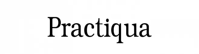
A classic serif typeface with elegant and traditional design elements.
![Practiqua les polices de caractères gratuit t�l�charger]() Télécharger 1744 Téléchargements@WebFont
Télécharger 1744 Téléchargements@WebFont -
( Fonts by Jurgen Geiger - www.geigerartwork.de )
A bold, italicized serif font with strong strokes and elegant curves.
![Serif BlackItalic les polices de caractères gratuit t�l�charger]() Télécharger 1744 Téléchargements@WebFont
Télécharger 1744 Téléchargements@WebFont -
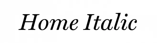
![Home Italic les polices de caractères gratuit t�l�charger]() Télécharger 1744 Téléchargements@WebFont
Télécharger 1744 Téléchargements@WebFont -
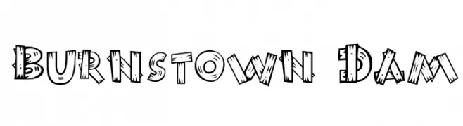
![Burnstown Dam les polices de caractères gratuit t�l�charger]() Télécharger 1744 Téléchargements@WebFont
Télécharger 1744 Téléchargements@WebFont


Quelles sont les polices les plus populaires en ce moment ?
Poppins, Roboto, Montserrat, Open Sans et Lato sont plébiscitées pour leurs formes nettes et leur large applicabilité — de l’identité de marque aux pages d’atterrissage et affiches.
Quelles polices sont souvent utilisées pour les logos ?
Les sans‑serifs géométriques (par ex. Poppins, familles de style Gotham) sont un choix courant pour un branding propre et scalable. Pour une touche personnelle, les scripts et styles manuscrits restent des classiques. Associez un display marqué pour les titres à un texte neutre pour l’équilibre et la reconnaissance.
À quelle fréquence la liste est‑elle mise à jour ?
Régulièrement, selon les téléchargements et l’activité réelle. Revenez souvent pour découvrir les futures favorites.
💡 Astuce : ajoutez cette page aux favoris — les tendances changent vite et les polices phares d’aujourd’hui peuvent inspirer le rebranding de demain.