Bienvenue dans Polices Populaires — là où se rencontrent popularité et qualité. Voici les polices les plus téléchargées et utilisées cette année. Pour des choix sûrs (logos, web, social), commencez ici.
Chaque police phare se distingue par équilibre, lisibilité et polyvalence. Vous trouverez des sans‑serifs modernes, des scripts élégantes, des serifs vintage et des displays minimalistes.
-
( Fonts by Jacob Fisher - www.pizzadude.dk )
A playful, rounded font with bold, smooth curves and a friendly appearance.
 Télécharger 1716 Téléchargements@WebFont
 -
( Fonts by www.fontmesa.com )
A bold, geometric font with strong, consistent strokes and an industrial feel.
![Ferro Rosso les polices de caractères gratuit t�l�charger]() Télécharger 1716 Téléchargements@WebFont
Télécharger 1716 Téléchargements@WebFont -
( Fonts by www.studiotypo.com - Personal-use only. For commercial use please contact owner. )
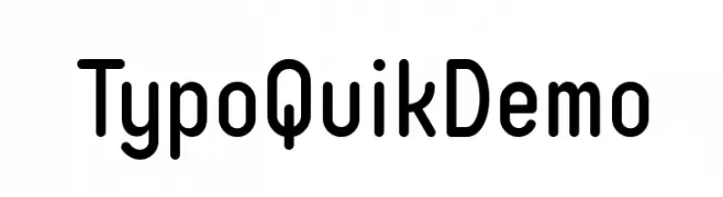
A modern, rounded sans-serif font with excellent readability.
![Typo Quik Demo les polices de caractères gratuit t�l�charger]() Télécharger 1715 Téléchargements@WebFont
Télécharger 1715 Téléchargements@WebFont -
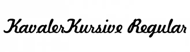
![KavalerKursive Regular les polices de caractères gratuit t�l�charger]() Télécharger 1715 Téléchargements@WebFont
Télécharger 1715 Téléchargements@WebFont -
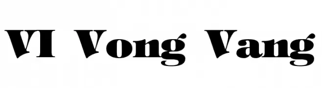
![VI Vong Vang les polices de caractères gratuit t�l�charger]() Télécharger 1715 Téléchargements@WebFont
Télécharger 1715 Téléchargements@WebFont -
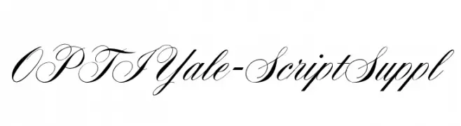
( Fonts by Castcraft Software - OPTI Fonts Archive - opti.netii.net - Personal-use only. For commercial use please contact owner. )
An elegant script font with flowing, cursive letters and high contrast strokes.
![OPTIYale-ScriptSuppl les polices de caractères gratuit t�l�charger]() Télécharger 1714 Téléchargements@WebFont
Télécharger 1714 Téléchargements@WebFont -
![Bajaj Sans Regular les polices de caractères gratuit t�l�charger]() Télécharger 1714 Téléchargements@WebFont
Télécharger 1714 Téléchargements@WebFont -
( Fonts by Mike Wolf )
A playful, geometric font with bold, rounded characters enclosed in circular shapes.
![Aragon les polices de caractères gratuit t�l�charger]() Télécharger 1714 Téléchargements@WebFont
Télécharger 1714 Téléchargements@WebFont -
( Fonts by www.haroldsfonts.com )
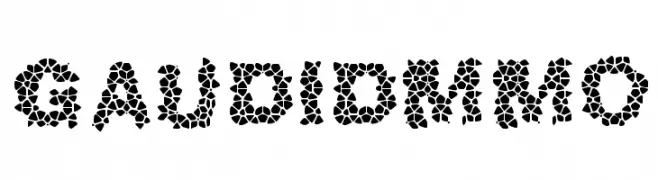
A mosaic-patterned font with a bold, artistic style.
![GaudiDemo les polices de caractères gratuit t�l�charger]() Télécharger 1714 Téléchargements@WebFont
Télécharger 1714 Téléchargements@WebFont -
( Fonts by Ben Weiner - www.readingtype.org )
A clean, modern sans-serif font with balanced proportions and excellent readability.
![Puritan les polices de caractères gratuit t�l�charger]() Télécharger 1714 Téléchargements@WebFont
Télécharger 1714 Téléchargements@WebFont -
( Fonts by Christine Mauerkirchner and Rainer Grunert - PrimaFont )
A bold, angular font with a futuristic and edgy design.
![Xtra les polices de caractères gratuit t�l�charger]() Télécharger 1714 Téléchargements@WebFont
Télécharger 1714 Téléchargements@WebFont -
( Fonts by Fontry - M.G. Adkins - Personal-use only. For commercial use please contact owner. )
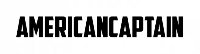
A bold, blocky font with a vintage military style.
![American Captain les polices de caractères gratuit t�l�charger]() Télécharger 1713 Téléchargements@WebFont
Télécharger 1713 Téléchargements@WebFont -
( Fonts by Vladimir Nikolic - www.creativefabrica.com/designer/vladimirnikolic/ - Personal-use only. For commercial use please contact owner. )
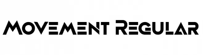
A bold, geometric font with sharp angles and a modern aesthetic.
![Movement Regular les polices de caractères gratuit t�l�charger]() Télécharger 1713 Téléchargements@WebFont
Télécharger 1713 Téléchargements@WebFont -
( Fonts by Cristiano Sobral - Personal-use only. For commercial use please contact owner. )
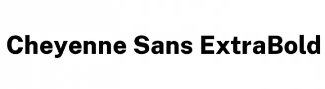
A bold, modern sans-serif typeface with strong, uniform strokes.
![Cheyenne Sans ExtraBold les polices de caractères gratuit t�l�charger]() Télécharger 1713 Téléchargements@WebFont
Télécharger 1713 Téléchargements@WebFont -
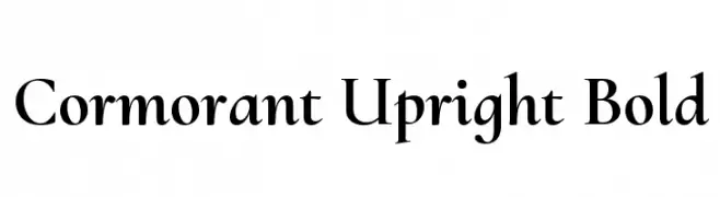
( Copyright (c) 2015, Christian Thalmann and the Cormorant Project Authors (github.com/CatharsisFonts/Cormorant) )
A bold, elegant serif font with high contrast and classic styling.
![Cormorant Upright Bold les polices de caractères gratuit t�l�charger]() Télécharger 1713 Téléchargements@WebFont
Télécharger 1713 Téléchargements@WebFont -
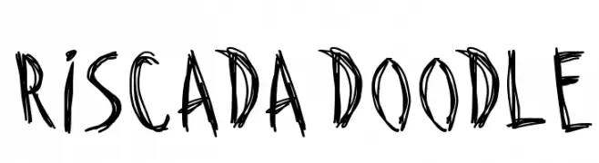
( Fonts by Galdino Otten - galdinootten.com )
A playful, hand-drawn font with a sketch-like, whimsical appearance.
![Riscada Doodle les polices de caractères gratuit t�l�charger]() Télécharger 1713 Téléchargements@WebFont
Télécharger 1713 Téléchargements@WebFont -
( Fonts by Creative Zone )
A bold, playful, and hand-drawn font with rounded, thick characters.
![Balinesia les polices de caractères gratuit t�l�charger]() Télécharger 1712 Téléchargements@WebFont
Télécharger 1712 Téléchargements@WebFont -
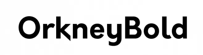
( Fonts by Hanken Design Co. - Personal-use only. For commercial use please contact owner. )
A bold, modern sans-serif font with a clean and geometric design.
![Orkney Bold les polices de caractères gratuit t�l�charger]() Télécharger 1712 Téléchargements@WebFont
Télécharger 1712 Téléchargements@WebFont -
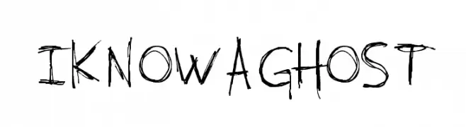
( Dismantle Destroy - Matthew Tyndall - creativemarket.com/Dismantle )
A raw, hand-drawn font with an edgy, artistic flair and uneven strokes.
![I KNOW A GHOST les polices de caractères gratuit t�l�charger]() Télécharger 1712 Téléchargements@WebFont
Télécharger 1712 Téléchargements@WebFont -
( Fonts by Galdino Otten - galdinootten.com )
A bold, textured serif font with a hand-drawn, playful style.
![School Book New les polices de caractères gratuit t�l�charger]() Télécharger 1712 Téléchargements@WebFont
Télécharger 1712 Téléchargements@WebFont -
( Fonts by Nick Curtis - www.nicksfonts.com )
A modern, rounded font with a playful and approachable style.
![Doctor Jekyll NF les polices de caractères gratuit t�l�charger]() Télécharger 1712 Téléchargements@WebFont
Télécharger 1712 Téléchargements@WebFont -
( Fonts by Ellen Luff - Personal-use only. For commercial use please contact owner. )
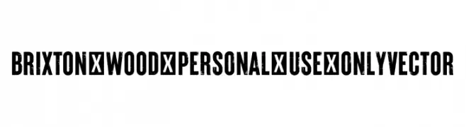
A bold, distressed font with a vintage, grunge aesthetic.
![Brixton_Wood_PERSONAL_USE_ONLY Vector les polices de caractères gratuit t�l�charger]() Télécharger 1711 Téléchargements@WebFont
Télécharger 1711 Téléchargements@WebFont -
![Beanstalker DEMO Regular les polices de caractères gratuit t�l�charger]() Télécharger 1711 Téléchargements@WebFont
Télécharger 1711 Téléchargements@WebFont -
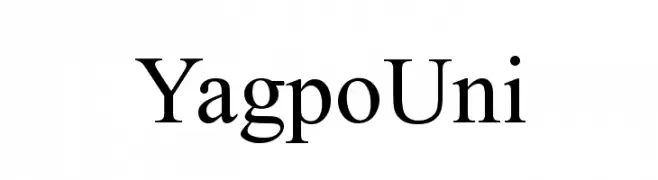
( Open Source Buddhism Library - www.buddism.ru )
A classic serif typeface with elegant strokes and balanced proportions.
![YagpoUni les polices de caractères gratuit t�l�charger]() Télécharger 1711 Téléchargements@WebFont
Télécharger 1711 Téléchargements@WebFont -
( Copyright 2011 The Podkova Project Authors (contact@cyreal.org) )
A bold slab serif font with strong, block-like serifs and consistent stroke widths.
![Podkova ExtraBold les polices de caractères gratuit t�l�charger]() Télécharger 1711 Téléchargements@WebFont
Télécharger 1711 Téléchargements@WebFont -
![AButterflyOnaDaffodil les polices de caractères gratuit t�l�charger]() Télécharger 1711 Téléchargements@WebFont
Télécharger 1711 Téléchargements@WebFont -
( Font by Jonathan Harris - www.tattoowoo.com )
A playful, hand-drawn font with a whimsical and childlike charm.
![Kids Play les polices de caractères gratuit t�l�charger]() Télécharger 1711 Téléchargements@WebFont
Télécharger 1711 Téléchargements@WebFont -
( Copyright (c) 2011-2012, Sorkin Type Co (www.sorkintype.com), with Reserved Font Name "Headland" )
A modern serif font with clean lines and balanced proportions.
![Headland One les polices de caractères gratuit t�l�charger]() Télécharger 1711 Téléchargements@WebFont
Télécharger 1711 Téléchargements@WebFont -
![Federation TNG Title les polices de caractères gratuit t�l�charger]() Télécharger 1711 Téléchargements@WebFont
Télécharger 1711 Téléchargements@WebFont -
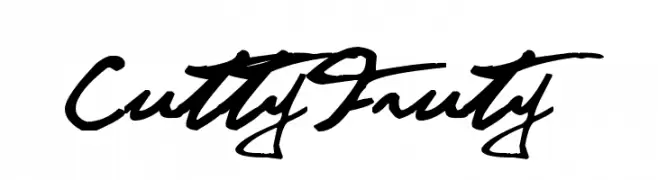
( Fonts are free for a personal use only - www.cuttyfruty.com )
A lively and expressive handwritten font with fluid, cursive strokes.
![CuttyFruty les polices de caractères gratuit t�l�charger]() Télécharger 1711 Téléchargements@WebFont
Télécharger 1711 Téléchargements@WebFont -
Polices par YanisM75. For commercial use please contact the owner.
( This font is free for PERSONAL USE only . You can purchase a commercial licence by sending an email to y.mejladi@hotmail.fr )
A bold, geometric font with a futuristic and modern design.
![Proximateus les polices de caractères gratuit t�l�charger]() Télécharger 1710 Téléchargements@WebFont
Télécharger 1710 Téléchargements@WebFont -
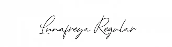
![Lunafreya Regular les polices de caractères gratuit t�l�charger]() Télécharger 1710 Téléchargements@WebFont
Télécharger 1710 Téléchargements@WebFont -
( Copyright (c) 2012-2015, The Mozilla Foundation and Telefonica S.A. )
A modern, condensed sans-serif font with clean lines and excellent legibility.
![Fira Sans Condensed Medium les polices de caractères gratuit t�l�charger]() Télécharger 1710 Téléchargements@WebFont
Télécharger 1710 Téléchargements@WebFont -
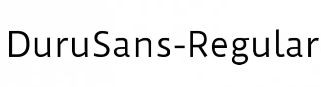
( Copyright (c) 2011 by Sorkin Type Co (www.sorkintype.com) )
A clean and modern sans-serif font with excellent readability and balance.
![DuruSans-Regular les polices de caractères gratuit t�l�charger]() Télécharger 1710 Téléchargements@WebFont
Télécharger 1710 Téléchargements@WebFont -
![SF Alien Encounters Solid Italic les polices de caractères gratuit t�l�charger]() Télécharger 1710 Téléchargements@WebFont
Télécharger 1710 Téléchargements@WebFont


Quelles sont les polices les plus populaires en ce moment ?
Poppins, Roboto, Montserrat, Open Sans et Lato sont plébiscitées pour leurs formes nettes et leur large applicabilité — de l’identité de marque aux pages d’atterrissage et affiches.
Quelles polices sont souvent utilisées pour les logos ?
Les sans‑serifs géométriques (par ex. Poppins, familles de style Gotham) sont un choix courant pour un branding propre et scalable. Pour une touche personnelle, les scripts et styles manuscrits restent des classiques. Associez un display marqué pour les titres à un texte neutre pour l’équilibre et la reconnaissance.
À quelle fréquence la liste est‑elle mise à jour ?
Régulièrement, selon les téléchargements et l’activité réelle. Revenez souvent pour découvrir les futures favorites.
💡 Astuce : ajoutez cette page aux favoris — les tendances changent vite et les polices phares d’aujourd’hui peuvent inspirer le rebranding de demain.