Bienvenue dans Polices Populaires — là où se rencontrent popularité et qualité. Voici les polices les plus téléchargées et utilisées cette année. Pour des choix sûrs (logos, web, social), commencez ici.
Chaque police phare se distingue par équilibre, lisibilité et polyvalence. Vous trouverez des sans‑serifs modernes, des scripts élégantes, des serifs vintage et des displays minimalistes.
-
 Télécharger 1458 Téléchargements@WebFont
 -
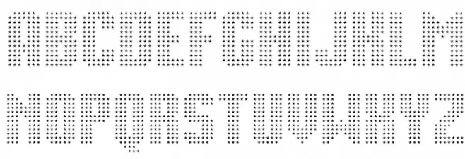
( Fonts by Dieter Steffmann )
An ornate and historical font with intricate, dramatic letterforms typical of the Schwabacher style.
![Schwabacher les polices de caractères gratuit t�l�charger]() Télécharger 1458 Téléchargements@WebFont
Télécharger 1458 Téléchargements@WebFont -
![Movie StarA les polices de caractères gratuit t�l�charger]() Télécharger 1458 Téléchargements@WebFont
Télécharger 1458 Téléchargements@WebFont -
( Fonts by Goldman Sans - https://design.gs.com/d/design-system/foundation/typography/ - Personal-use only. For commercial use please contact owner. )
A clean, modern sans-serif typeface with uniform stroke thickness and balanced spacing.
![Goldman Sans Regular les polices de caractères gratuit t�l�charger]() Télécharger 1457 Téléchargements@WebFont
Télécharger 1457 Téléchargements@WebFont -
( Fonts by Woodcutter Manero - www.woodcutter.es - Personal-use only. For commercial use please contact owner. )
A bold, playful font with a hand-drawn, whimsical style.
![Simulacro les polices de caractères gratuit t�l�charger]() Télécharger 1457 Téléchargements@WebFont
Télécharger 1457 Téléchargements@WebFont -
( Noto is a trademark of Google Inc. Noto fonts are open source. All Noto fonts are published under the SIL Open Font License, Version 1.1 )
A bold, modern sans-serif font with clean lines and balanced spacing.
![Noto Sans Bengali Bold les polices de caractères gratuit t�l�charger]() Télécharger 1457 Téléchargements@WebFont
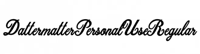
Télécharger 1457 Téléchargements@WebFont -
![Dattermatter Personal Use Regular les polices de caractères gratuit t�l�charger]() Télécharger 1457 Téléchargements@WebFont
Télécharger 1457 Téléchargements@WebFont -
( Copyright (c) 2011 Alejandro Paul (sudtipos@sudtipos.com) )
A bold, flowing script font with elegant, connected characters.
![Mrs Sheppards Regular les polices de caractères gratuit t�l�charger]() Télécharger 1457 Téléchargements@WebFont
Télécharger 1457 Téléchargements@WebFont -
![VI Bodacious [Bum] Normal les polices de caractères gratuit t�l�charger]() Télécharger 1457 Téléchargements
Télécharger 1457 Téléchargements -
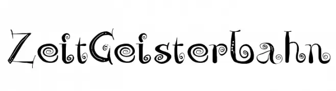
( Fonts by Manfred Klein - manfred-klein.ina-mar.com )
A whimsical, decorative font with playful swirls and embellishments.
![ZeitGeisterbahn les polices de caractères gratuit t�l�charger]() Télécharger 1457 Téléchargements@WebFont
Télécharger 1457 Téléchargements@WebFont -
( Free for non-commercial use. www.johnmartz.com )
A bold, angular font with a futuristic and industrial design.
![Science Project les polices de caractères gratuit t�l�charger]() Télécharger 1457 Téléchargements@WebFont
Télécharger 1457 Téléchargements@WebFont -
![Rocco-Regular les polices de caractères gratuit t�l�charger]() Télécharger 1456 Téléchargements@WebFont
Télécharger 1456 Téléchargements@WebFont -
( Vladimir Nikolic - www.coroflot.com/vladimirnikolic )
A bold, angular blackletter-inspired font with a modern 3D shadow effect.
![Robert Regular les polices de caractères gratuit t�l�charger]() Télécharger 1456 Téléchargements@WebFont
Télécharger 1456 Téléchargements@WebFont -
Polices par joorgemoron. For commercial use please contact the owner.
( Free for personal use. )
A classic, serif font with bold, sharp serifs and a traditional aesthetic.
![JMH Holy Bible les polices de caractères gratuit t�l�charger]() Télécharger 1456 Téléchargements@WebFont
Télécharger 1456 Téléchargements@WebFont -
( Fonts by Levi Szekeres - www.loremipsum.ro. Personal-use only. For commercial use please contact owner. )
A modern, rounded font with a clean and approachable design.
![Ruler les polices de caractères gratuit t�l�charger]() Télécharger 1456 Téléchargements@WebFont
Télécharger 1456 Téléchargements@WebFont -
( Fonts by Maelle.K - Thomas Boucherie )
An elegant script font with flowing, interconnected letters and ornate details.
![Mademoiselle Camille L les polices de caractères gratuit t�l�charger]() Télécharger 1456 Téléchargements@WebFont
Télécharger 1456 Téléchargements@WebFont -
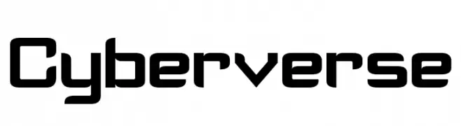
( Fonts by a Neale Davidson - www.pixelsagas.com. Personal-use only. For commercial use please contact owner. )
A futuristic, geometric font with bold, angular letterforms.
![Cyberverse les polices de caractères gratuit t�l�charger]() Télécharger 1456 Téléchargements@WebFont
Télécharger 1456 Téléchargements@WebFont -
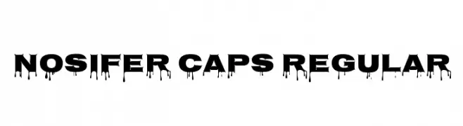
( Copyright (c) 2011, Typomondo )
A bold, dripping font ideal for horror-themed designs.
![Nosifer Caps Regular les polices de caractères gratuit t�l�charger]() Télécharger 1456 Téléchargements@WebFont
Télécharger 1456 Téléchargements@WebFont -
( Copyright (c) 2011, Open Window (https://profiles.google.com/openwindowfonts/about) )
A bold, dynamic script font with fluid, connected letterforms and a playful style.
![Miniver les polices de caractères gratuit t�l�charger]() Télécharger 1456 Téléchargements@WebFont
Télécharger 1456 Téléchargements@WebFont -
( Fonts by www.alphabetype.it )
A bold, angular font with a geometric, hieroglyphic-inspired design.
![Cleopatra les polices de caractères gratuit t�l�charger]() Télécharger 1456 Téléchargements@WebFont
Télécharger 1456 Téléchargements@WebFont -
( Fonts by SDFonts - Ritzy )
A bold, modern font with geometric and uniform characters.
![Speedlearn Normal les polices de caractères gratuit t�l�charger]() Télécharger 1456 Téléchargements@WebFont
Télécharger 1456 Téléchargements@WebFont -
![Grunge Regular les polices de caractères gratuit t�l�charger]() Télécharger 1456 Téléchargements@WebFont
Télécharger 1456 Téléchargements@WebFont -
![VTCKomixationSCBoldItalic les polices de caractères gratuit t�l�charger]() Télécharger 1456 Téléchargements@WebFont
Télécharger 1456 Téléchargements@WebFont -
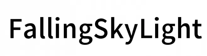
( Fonts by CannotIntoSpaceFonts - KineticPlasma Fonts - Personal-use only. For commercial use please contact owner. )
A clean, modern sans-serif font with uniform stroke width and excellent readability.
![Falling Sky Light les polices de caractères gratuit t�l�charger]() Télécharger 1455 Téléchargements@WebFont
Télécharger 1455 Téléchargements@WebFont -
( Fonts by Katsia Jazwinska )
A playful, condensed font with a hand-drawn feel and medium contrast.
![Better Together Condenesed les polices de caractères gratuit t�l�charger]() Télécharger 1455 Téléchargements@WebFont
Télécharger 1455 Téléchargements@WebFont -
( Fonts by Geronimo Fonts - Personal-use only. For commercial use please contact owner. )
A playful, rounded font with a friendly and approachable style.
![Back to School les polices de caractères gratuit t�l�charger]() Télécharger 1455 Téléchargements@WebFont
Télécharger 1455 Téléchargements@WebFont -
![Pullstar les polices de caractères gratuit t�l�charger]() Télécharger 1455 Téléchargements@WebFont
Télécharger 1455 Téléchargements@WebFont -
( Fonts by www.woodardworks.com )
A playful, rounded font with smooth curves and a friendly appearance.
![Veggieburger les polices de caractères gratuit t�l�charger]() Télécharger 1455 Téléchargements@WebFont
Télécharger 1455 Téléchargements@WebFont -
( Copyright (c) 2011 by Brian J. Bonislawsky DBA Astigmatic (AOETI) )
A classic calligraphic font with elegant, flowing lines and high contrast.
![Fondamento les polices de caractères gratuit t�l�charger]() Télécharger 1455 Téléchargements@WebFont
Télécharger 1455 Téléchargements@WebFont -
( Copyright (c) 2011, Dario Manuel Muhafara (http://www.tipo.net.ar) )
A playful, hand-drawn style font with rounded, irregular strokes.
![Overlock SC les polices de caractères gratuit t�l�charger]() Télécharger 1455 Téléchargements@WebFont
Télécharger 1455 Téléchargements@WebFont -
( Fonts by Manfred Klein. Free for private and charity use. Free for commercial with donation to organizations )
A classic serif font with modern elegance and unique hieroglyphic symbols.
![Egypt les polices de caractères gratuit t�l�charger]() Télécharger 1455 Téléchargements@WebFont
Télécharger 1455 Téléchargements@WebFont -
( Fonts by Graham Meade - GemFonts )
A bold, 3D geometric font with a striking shadow effect.
![Ardour 3D GM les polices de caractères gratuit t�l�charger]() Télécharger 1455 Téléchargements@WebFont
Télécharger 1455 Téléchargements@WebFont -
( Fonts by mlkwsn - www.mlkwsn.com - Personal-use only. For commercial use please contact owner. )
An elegant serif font with classic, refined characters and slight stroke contrast.
![Mories les polices de caractères gratuit t�l�charger]() Télécharger 1454 Téléchargements@WebFont
Télécharger 1454 Téléchargements@WebFont -
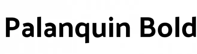
( Copyright 2014 Pria Ravichandran (pria.ravichandran@gmail.com) )
A modern, bold typeface with clean lines and excellent readability.
![Palanquin Bold les polices de caractères gratuit t�l�charger]() Télécharger 1454 Téléchargements@WebFont
Télécharger 1454 Téléchargements@WebFont -
![UTMTimesBold Italic les polices de caractères gratuit t�l�charger]() Télécharger 1454 Téléchargements@WebFont
Télécharger 1454 Téléchargements@WebFont


![VI Bodacious [Bum] Normal les polices de caractères gratuit t�l�charger](https://d144mzi0q5mijx.cloudfront.net/img/V/I/VI-Bodacious-Bum-Normal.webp)


Quelles sont les polices les plus populaires en ce moment ?
Poppins, Roboto, Montserrat, Open Sans et Lato sont plébiscitées pour leurs formes nettes et leur large applicabilité — de l’identité de marque aux pages d’atterrissage et affiches.
Quelles polices sont souvent utilisées pour les logos ?
Les sans‑serifs géométriques (par ex. Poppins, familles de style Gotham) sont un choix courant pour un branding propre et scalable. Pour une touche personnelle, les scripts et styles manuscrits restent des classiques. Associez un display marqué pour les titres à un texte neutre pour l’équilibre et la reconnaissance.
À quelle fréquence la liste est‑elle mise à jour ?
Régulièrement, selon les téléchargements et l’activité réelle. Revenez souvent pour découvrir les futures favorites.
💡 Astuce : ajoutez cette page aux favoris — les tendances changent vite et les polices phares d’aujourd’hui peuvent inspirer le rebranding de demain.